

Media Gallery
Display a collection of images or media for visual browsing
This component supports storytelling and exploration by presenting multiple visual assets in a structured gallery layout.

Example page context showing where a Media Gallery is typically used
✓ Use this component when:
- You have multiple related images or media assets
- Visual content is central to the page’s purpose
- Users benefit from browsing or viewing media sequentially
- Images provide meaningful context or documentation
✕ Avoid using this component when:
- A single image is sufficient (use Image instead)
- Images are decorative and not content-bearing
- Users must read detailed text alongside each item
- The page requires dense or task-focused layout
Choosing Between Similar Components
If your goal is…
| Your goal | Use this component |
|---|---|
Display multiple images for browsing | Media Gallery |
Show a single image | Image |
Feature one story, event, or initiative | 50/50 Card |
Provide quick links or actions | Button-Style Cards |
Media Gallery Overview
A Media Gallery component displays a curated collection of media items (images, audio, video, or externally hosted media). Media Galleries help highlight visual stories, showcase collections, or present multiple related assets in one place.
Example: Showcasing exhibit photography
This example shows a Media Gallery used to present event photography, allowing users to browse images within a cohesive visual collection.
Elements of a Media Gallery
| Element | Purpose |
|---|---|
Heading | Provides the title for the media item |
Media item | Shows a preview that users can select to view larger |
Caption | Adds brief context or credit below the media in full-screen view |
Media grid | Displays all gallery items in a browsable grid |
Full-screen view | Shows a larger version of the selected media item |
Modal navigation | Lets users move between media items in full-screen view |
Guidance on using a Media Gallery
- Use to showcase visual collections. Add a Media Gallery when users benefit from seeing multiple related images or media items together.
- Support exploration. Present media in a clear grid layout so users can quickly browse and discover items of interest.
- Enable focused viewing. Full-screen view allows users to examine details without distraction; encourage use of high-resolution media.
- Write concise, meaningful captions. Use captions to provide context or credit that helps users interpret the media.
- Ensure accessible descriptions. Provide accurate alternative text for each media item to support nonvisual users.
- Avoid overload. Include only the most relevant media and keep galleries at a manageable size for easy scanning.
Content guidelines
Ensure image quality
Use high-resolution images appropriate for display size.
Avoid redundant imagery
Do not include multiple images that convey the same information.
Write concise captions
Keep captions short and informative.
Accessibility considerations
- Provide descriptive alternative text for all meaningful images
- Ensure navigation controls are keyboard accessible
- Avoid using images that contain critical text without alternatives
- Maintain sufficient contrast for captions
Media Gallery features
| Features | Standards |
|---|---|
Images displayed in a consistent grid layout | Minimum Contrast |
Left-aligned headings and text | Text Block Alignment |
Background color, icons, and underlining used to indicate links | Link Indicators |
Full-screen modal supports keyboard navigation and logical focus order | Focus Order |
Media Gallery Showcase
This example shows the Media Gallery component set to display a collections of images
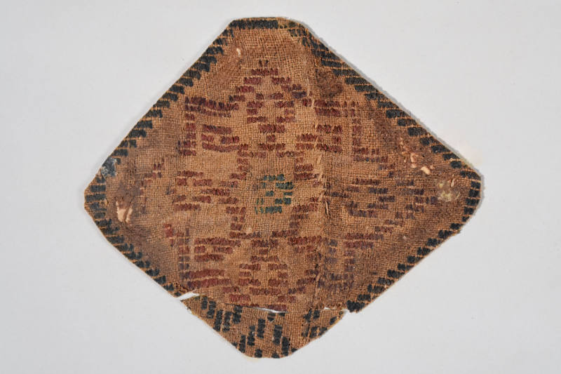
Fragment from a Brocaded Furnishing Textile
An approximately diamond-shaped cutting from a brocaded textile furnishing or wall hanging. A red star-shaped design with a blue-green center was created with supplementary (i.e. nonstructural) wefts on a tabby ground weave. Dark blue supplementary wefts
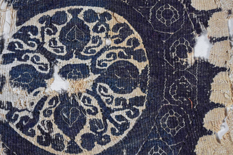
Roundel with Vases and Vines
Monochrome tapestry-woven roundel containing a design of vases and vines. The dark blue wefts are wool; the rest of the textile is linen.

Cartonnage Mummy Case of Padimut
This case originally held the mummy of Padimut, a wab-priest and metal engraver in the Temple of Amun-Re at Thebes during the 22nd Dynasty (945-712 BCE).

Cushion Cover with Kantharos
A large gold tapestry-woven square with a vase/kantharos in a medallion at its center. An eight-pointed gold starburst with a thick dark border surrounds this central medallion, with four of its points extending to the edge of the square.

Fragment of a Roundel with Interlace
This is approximately half of a weft-faced purple roundel decorated with geometric interlace. Purple wool wefts are woven on linen warps.
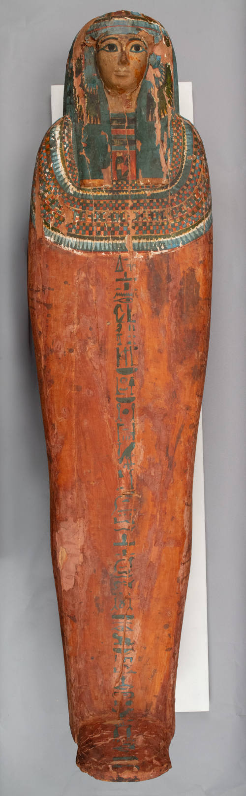
Coffin of Mut-iy-iy
These two coffins (1902.50.9 &1902.50.10), made of wood from the sacred sycamore fig tree, were discovered together in one tomb on the west bank at Thebes (modern Luxor).

False Door of Nebet, Priestess of Hathor
Egyptians believed that the spirit of the deceased could leave the netherworld through a recessed niche, which we call a “false door,” to enjoy items left by the living.

Group Statue of King Menkaure and Two Godesses
Menkaure built the smallest of the three Gaza Pyramids. In 1908, at the Harvard University–Boston Museum of Fine Arts sponsored excavations at the Pyramids, expedition director George Reisner found four complete group statues (or triads) in the king's nea