

Building an event one-pager for summits, conferences, and symposiums
When hosting a major event, like a summit, conference, or university-wide workshop, having one centralized page helps attendees prepare, participate, and stay informed.
A single event landing page makes it easy for your site visitors to quickly scan the information about your event. It also allows you to clone an event page and use it as a template for future events.
With HarvardSites components, you can create a polished, responsive event one-pager without any custom code.
Key layout techniques and components
Creating a great event page isn’t about cramming everything into one space, it’s about using the right layout tools to guide your audience through what matters. These components help you organize complex information clearly, keep the page scannable, and make it easier for attendees to get what they need, before, during, and after your event.


Sample one-page event site with agenda, sessions, map, exhibitors, and contact info.
Welcome + hero section
Use a Hero or Section Heading with a brief event intro to establish context and tone.

Recommended Component: Hero
Benefits
- Creates an immediate sense of purpose and professionalism
- Sets expectations for the day and orients visitors
- Visually anchors the page with high-impact messaging
Watch Out For
- Don’t overload with text, keep it short and action-oriented
- Your hero image should complement the event, and not distract. Use an image that is related to your event or department
Agenda or at-a-glance schedule
Display a schedule using a Table for clarity.

Recommended Components: Inline Table
Benefits
- Helps users quickly scan the structure of the day
- Reinforces clarity around timing and location
- Encourages punctuality and better flow between sessions
Watch Out For
- Avoid cramming too many details into table cells
- Keep times consistent (AM/PM vs 24hr format)
- Avoid having too many columns. This makes it hard to view on mobile devices
Filterable breakout sessions
A Button-style Card component helps to create a manually-curated list combining topic and format groupings.
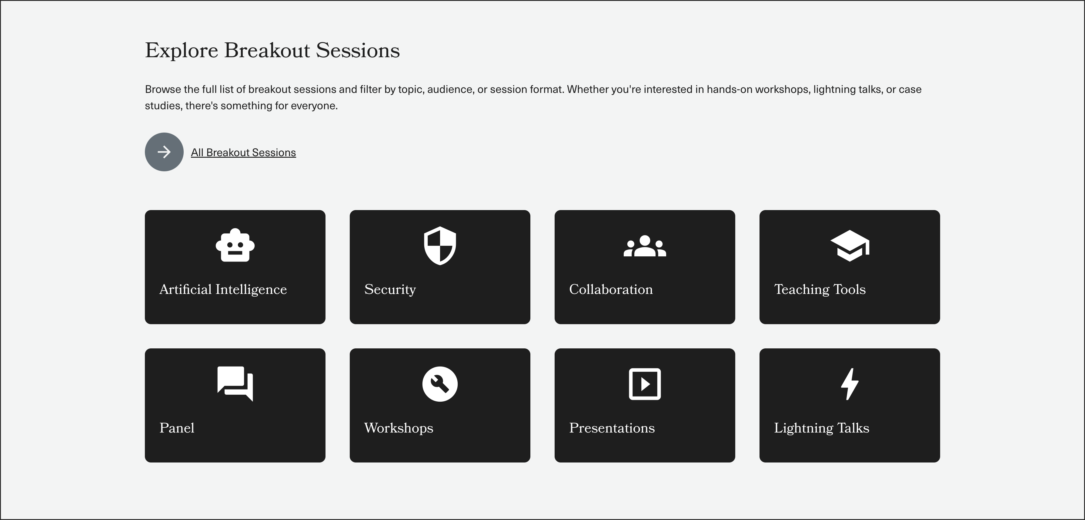
Recommended Components: Button-style Cards, Vertical Cards, Page List, Event List with taxonomy-based filtering (or custom List with exposed filters)
Benefits
- Helps attendees find the breakout sessions they are interested in
- Encourages deeper engagement by role or interest
- Keeps long lists organized and non-overwhelming
Watch Out For
- Requires consistent taxonomy tagging behind the scenes
- Filters can clutter mobile UI if too many are shown at once
- Make sure filter labels are clear and user-friendly
Attendee Information
Use an Accordion to organize logistics and additional info (e.g., restrooms, accommodations, transportation, health protocols).
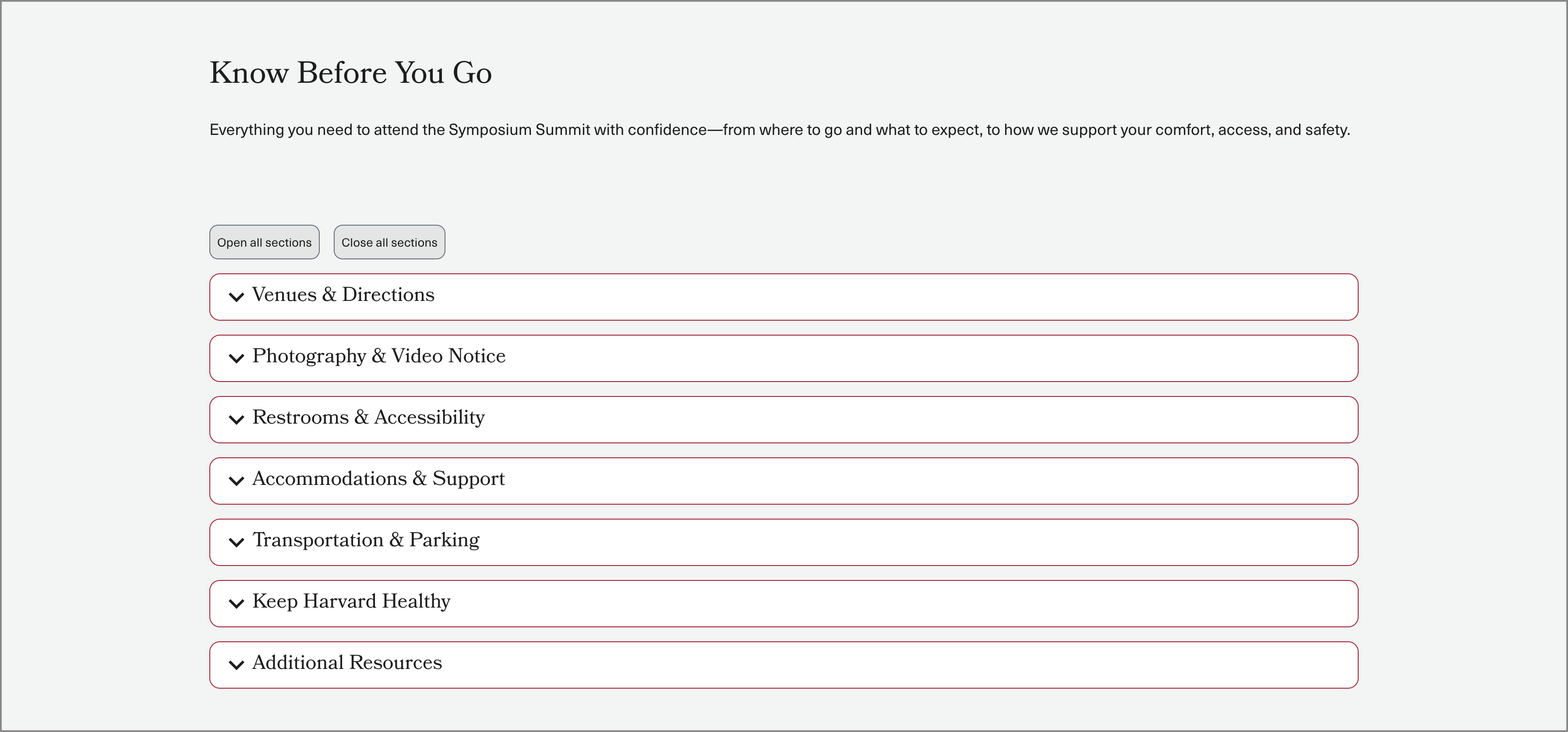
Recommended Components: Accordion
Benefits
- Keeps secondary logistics easy to access without overwhelming the page
- Supports mobile readability with collapsible sections
- Encourages self-service for commonly asked questions
Watch Out For
- Important info (like accessibility or health guidance) may be overlooked if collapsed
- Too many accordion panels can feel cluttered, group intentionally
- Avoid dense paragraphs, use bullets or headings for clarity
Venue map
Embed or upload a venue map as an image with caption in a 50-50 component, Image component, or embed an external map tool or PDF.
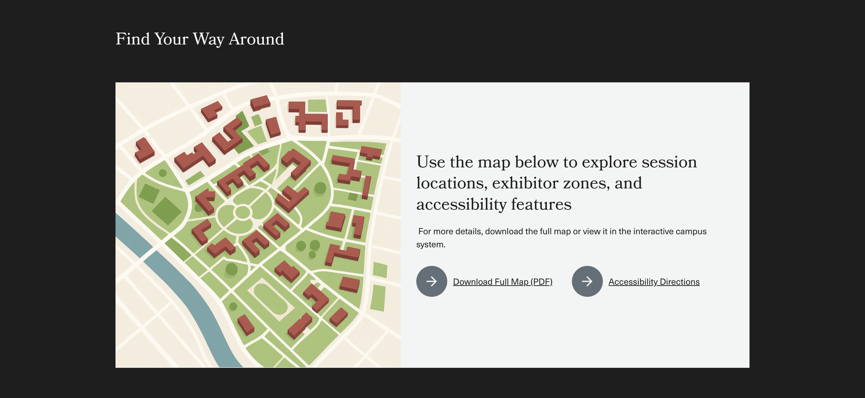
Recommended Components: 50-50 Card, Image
Benefits
- Helps attendees orient themselves before arriving
- Reduces wayfinding stress and staff support needs
Watch Out For
- Accessibility: Make sure the map is useable by individuals using assistive technology
- Ensure images or PDFs are high-res but optimized for load speed
- Don’t rely on visuals alone, include alt text or a caption
- Avoid embedding third-party maps without testing accessibility
Exhibitor listing by tier
Use Tabs or Accordion to group exhibitors into categories: Anchor, Display, Networking, and Patron.
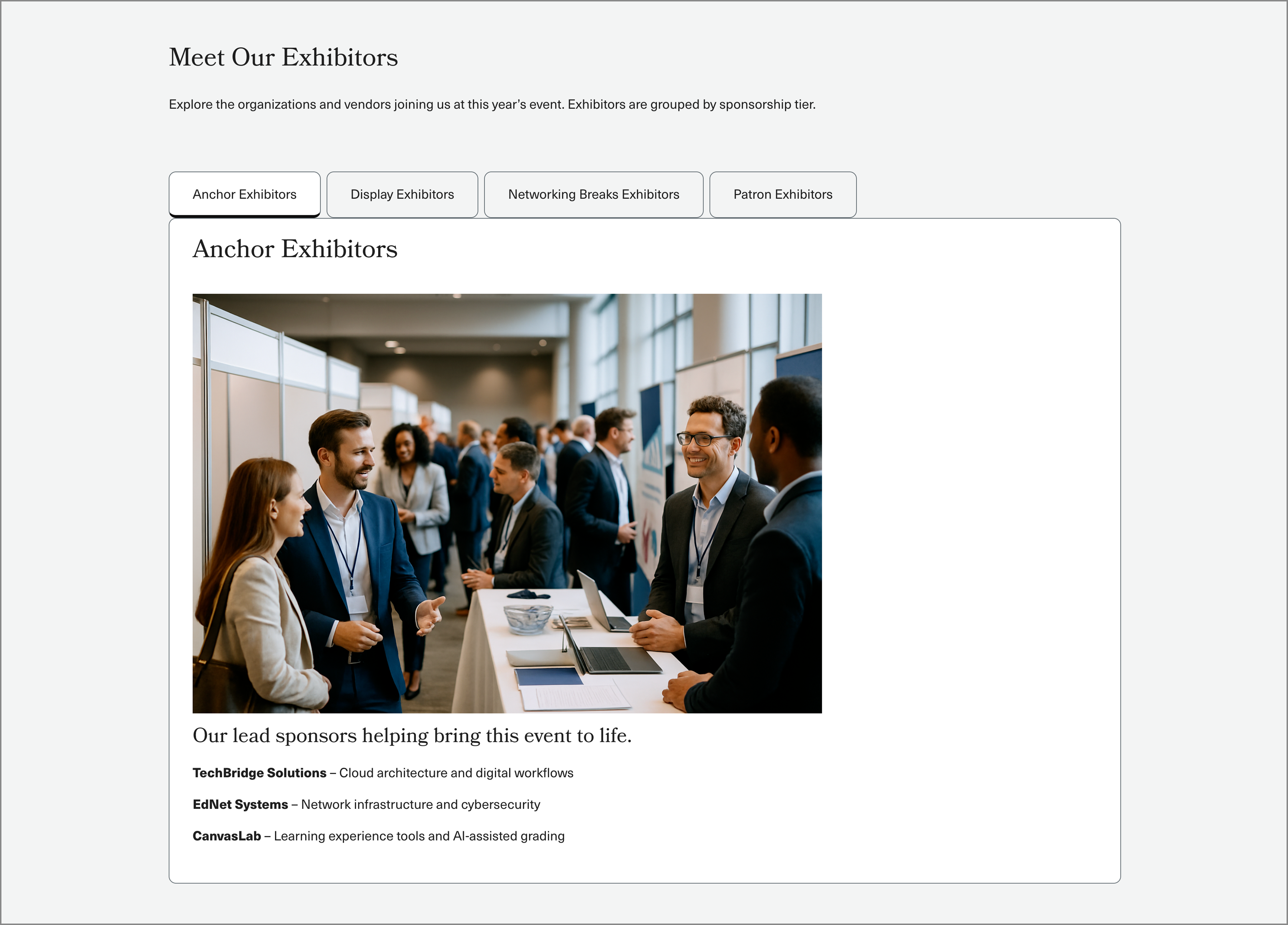
Recommended Components: Tabs
Benefits
- Organizes large lists into a clean, easy-to-browse format
- Gives visibility to top-tier sponsors and supporters
- Encourages attendees to visit exhibitor areas intentionally
Watch Out For
- Too many tiers or entries can overwhelm, keep labels and content short and clear
- Consistent formatting matters: Align logo sizes, text, and spacing
Display planning and support teams
Display of planning and support teams using Vertical Cards.

Recommended Components: Vertical Cards, Columns (Coming soon)
Benefits
- Makes support feel personal and accessible
- Builds trust by showing the real team behind the event
- Helps route questions to the right people
Watch Out For
- Long contact lists can look cluttered, group by role or need
- Avoid duplicating contact info across the site
- Be clear about which contact is for which type of question